Intro animations and other polish
(For earlier discussions on the game, please check out the ongoing talk on Discord: https://discord.com/channels/675983554655551509/1162194856597258292 )
Back in January I mentioned I wanted to launch before March (https://discord.com/channels/675983554655551509/1162194856597258292/119974522677... ) so let's see where we're at. First of all, the game hasn't launched yet. While from a tech and stability standpoint the game is good to go, I don't feel comfortable throwing it out into the wild just yet. There's a few things I'd still like to touch up before that. Balance-wise, I still don't have quite enough playtesting data to really be able to implement any informed changes. I'll need to step up my playtesting game, as I've been getting distracted by other, more shiny bits - more on that below.
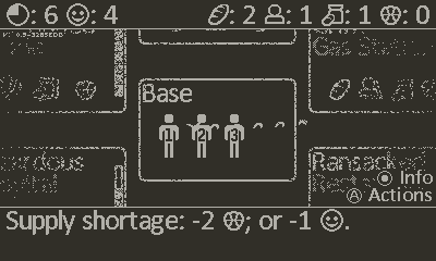
I've also been working on the first-play experience and in-game communication, refining the tutorial and its flow, and adding an introductory scene when starting a scenario. It's just a scrolling image with captions, but I do think it helps a lot in setting the scene and getting the player engaged with the game. Another suggestion was custom game over and victory screens rather than generic popups, which I really like and will probably try to do as well. See the work-in-progress intro for Armageddon here:
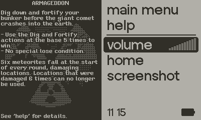
Also visible in the video above is the new objective popup at the start of a game, telling you what you need to do to win the scenario. It's only one of several popups at the start of a game so it may be easy to skip or forget, which is why I also added a little prompt on the bottom-right when a player is in control telling them to press the home button for info, showing them the screen below (when playing Armageddon). I might expand on the prompt to include dpad and A button uses where applicable.


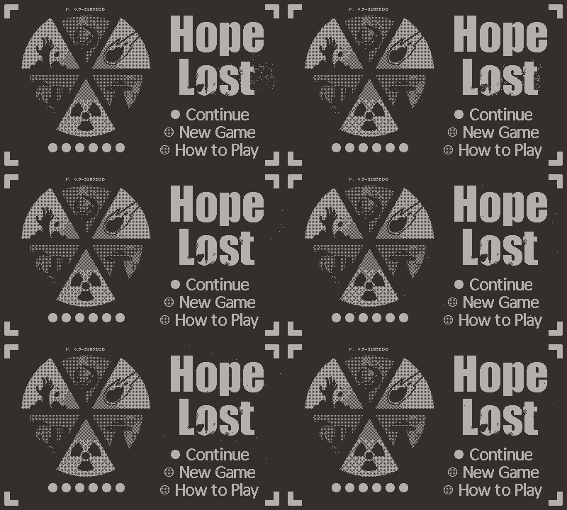
Another thing I made to grab a player's attention is a little animation of the logo degrading and little dust particles flying through the main menu. It's a small thing, but I really like how it turned out:
Lastly, I think the game has a bit of a problem standing out from the description I've been using since publishing the print-and-play original:
"Hope Lost is a 1-4 player cooperative choose-your-own-apocalypse game, featuring 6 different apocalypses to play through, each with their own objective and unique spin to the game’s common mechanics. Players will need to fight the apocalypses as well as time itself, all the while trying to make sure the survivors at the base have everything they need. Will you survive the apocalypse, or is all hope lost?"
One problem is obviously that the Playdate isn't really a multiplayer-focused console, so marketing it as 1-4 players might scare people off. At the time of writing I thought the use of 'choose-your-own-apocalypse' was funny but it's probably more confusing than anything else. I think I need to do a bit of rebranding - if there's any wordsmiths around, I'd love to hear your takes!
Get Hope Lost
Hope Lost
Can you survive the 6 apocalypses?
| Status | In development |
| Author | dennens |
| Genre | Survival |
| Tags | Black and White, Board Game, Pixel Art, Playdate |
| Languages | English |
More posts
- Hope Lost is out NOW!Feb 11, 2025
- Grayscale drawing tools now on github!May 15, 2024
- Demo available!Mar 22, 2024
- Run-time, screen-space ditheringMar 21, 2024
Leave a comment
Log in with itch.io to leave a comment.